Showing posts with label Dark Horse. Show all posts

Wednesday, 2 December 2015

Star Wars Omnibus: Clone Wars Volume 1: The Republic Goes to War Review (Unread 033)

I’ve written before about Dark Horse’s Star Wars comic omnibus collections. They’re pretty great. They’re designed to collect novel length stories and smaller stories that otherwise wouldn’t be collected anywhere else. I really like them because they’re huge and quite affordable. This volume is over 400 pages long. For the most part, these omnibus volumes include numerous issues all tied to a theme or a series or a time period. This one, obviously, is set during the Clone Wars. Particularly the beginning of the Clone Wars shortly after the events of Attack of the Clones.

A very large number of issues are included in this volume. Unfortunately, I will not list all of the creators involved because I’m lazy. However I’m pleased to announced that Dark Horse meticulously listed all creators at the beginning of each story. For this collection that meant almost every new issue. Most of the comics in this volume are short stories of approximately two issues in length (all the Jedi one-shots are double sized issues). Here are the contents of Clone Wars: The Republic Goes to War:

Wednesday, 4 June 2014

Star Wars Omnibus: The Complete Saga, part 2 review


Last week I started my review of Star Wars Omnibus: The Complete Saga published by Dark Horse comics. It includes the comic book adaptation of the first six Star Wars movies. The first part of the review focused on Episodes IV, V and VI. All three adaptations were originally published in single issue format by Marvel Comics a few decades ago. The actual stories included in this collection were reissues by Dark Horse to coincide with the release of the Star Wars: Special Edition DVDs. The second part of review will focus on the adaptations to the prequel trilogy.


Episode I: The Phantom Menace
Script: Henry Gilroy
Pencils: Rodolfo Damaggio
Inks: Al Williamson
Colours: Dave Nestelle
Colour Separation: Harold MacKinnon
Lettering: Steve Dutro

It’s been interesting to read the adaptations, mostly to experience how certain scenes from the movie are better suited to being adapted to comic form. Many scenes in The Phantom Menace are made up of people talking. As such, it’s rather simple to do a talking head comic. It’s a slower read than you would thing but there is a lot of dialogue in the movie and most of it is present in the comic. In comparison, most of the action sequences are cut short considerably. The pod racing scene takes place in just a handful of pages. Specifically, the entire race only takes up five pages! It’s not just the race though; all the action scenes are cut down to allow for all of the dialogue heavy scenes. It makes sense why the creative team decided to do so. Action takes more space to reproduce in comics than it would in a movie and while you could have rewritten all of the diplomatic and senatorial debates, it would have made for a less faithful adaptation and it’s a lot of work for little pay off. Yes, you’d then have more room for the action scenes but you wouldn’t be able to convey the same sense of spectacle and speed as the movie could. As such, the lightsaber duels, the battle on the plains of Naboo, the pod racing and the starfighter battle above Naboo all flounder and aren’t particularly interesting to read.

Perhaps unsurprisingly, most of the things I don’t like about the movie I also don’t like in the comic. Things like how the Gungans, particularly Jar-Jar Binks who has more “panel time” than any of the other Gungans, are super annoying. In the films you hear how they talk like idiots even if you’re not paying attention to them but it’s an entirely different thing to see their dialogue written out and then reading it. It magnifies the stupidity of their speech tenfold.

Shut up and listen to Yoda ya little brat!

The art is serviceable. It does what it’s supposed to do but the characters all look stiff, possibly because the artist is using the film as photo reference. The actors rarely look like themselves but that’s fine. As much as I like the thought of reading a comic starring Liam Neeson, there is no real need to have the characters look exactly like the actors who portrayed them in the film. What’s more troublesome is that most of the male characters look alike and many characters have a piggish nose. It’s kind of distracting to see similar facial characteristics on so many characters. Still, Damaggio gets the job done and I can’t really fault him for that. It’s just disappointing that Artoo and some of the starships are better drawn than most of the human characters.
                                                                                        
Episode II: Attack of the Clones
Script: Henry Gilroy
Pencils: Jan Duursema
Inks: Ray Kryssing
Colours: Digital Chameleon, Dan Jackson, Chris Horn, Jason Hvam, Dave Nestelle, Dave McCaig
Lettering: Steve Dutro

The art by Jan Duursema, who’s done quite a bit of Star Wars work in comics, is better than the art for Episode I. It’s very dark though, she uses a lot of inks and sometimes it’s too much. I appreciate how she embellished her art and avoided trying to simply draw screen captures of the film. She also changes the composition or a few scenes, giving us a different camera view than what we’re used to seeing.

Henry Gilroy scripted the adaptation for The Phantom Menace and Attack of the Clones but they’re both rather different comics. I’m certain that a lot of the differences have to do with the differences between both movies. While The Phantom Menace had a lot of dialogue with a few action sequences spread throughout the movie, Attack of the Clones has the same two types of sequences but the balance has shifted. There is more action and less dialogue and that has an impact on the adaptation. Similarly to the scripters for the adaptation of the original trilogy, Gilroy uses narration to help reduce the length of the action scenes. The battles on Geonosis, Obi-Wan and Jango Fett’s fight on Kamino, the lightsaber duel against Count Dooku, all of the action scenes use narration in some capacity. It works well because the action doesn’t feel as breezy and unimportant as they did in the adaptation of Episode I. These action scenes matter and the narration helps to slow it down and provide the reader with important, and sometimes even interesting, details. In every way, the adaptation for Attack of the Clones is better than the adaptation of The Phantom Menace. There is a noticeable improvement in storytelling and the result is a more enjoyable comic but it still fails to deliver as much impact as the movie.

Yoda dude, don't hold that lightsaber so close to your face. It's drying our your skin.


Episode III: Revenge of the Sith
Script: Miles Lane
Art: Doug Wheatley
Colours: Christopher Chuckry
Lettering: Michael David Thomas

After reading the comic book adaptation of Episode III, I’m very glad I decided to read these stories in the order in which the films were released because Revenge of the Sith is the best of all six adaptations by a considerable margin. It makes for a good way to end this trip through the comic book adaptations of the saga.

It’s pretty simple to see why this is a better adaptation than the others. For starters, it flows well. There are very few weird cuts or transitions from one scene to another. It doesn’t read like it’s adapting anything. To the contrary, it reads like an original comic story, the elements from the first half of the story progressively build to the elements of the second half and even though it’s titled Episode III, the end is quite satisfying. It also helps that like the story in the adaptation of A New Hope, this story focuses quite clearly on one main character and those closest to him. It’s Anakin’s story, everybody else is supporting that story. The story is tight, even when characters go off to do their own thing; it ties it to what’s happening to Anakin. That consistency in the story certainly helped with how well it could be adapted to another medium.
                                                                                                                                                                                
Naturally, some of the scenes in the movie are cut short, particularly the action sequences. I don’t mind because it actually helps to accentuate the focus on Anakin. Besides, the scenes are all there, They’re all here, the rescue of Chancellor Palpatine, the duel between Obi-Wan and General Grievous on Utapau, Yoda helping the Wookiees on Kashyyyk, the duel with the Sith Lord, Order 66 and of course the climactic battle between Anakin and Obi-Wan. They’re all shorter, yes, but those condensed sequences are well balanced by more dialogue heavy scenes which serve the purpose of plot and character development.  


The art is also the best of any of the adaptations. It has a painted quality that increases the sense of realism without relying on a heavy use of crosshatchings. The colouring palette is also less bright than the colouring for the adaptations of the previous episodes. It helps to reinforce the thematic elements of Anakin’s journey to the dark side as well as avoid the cartoonish look of some of the scenes in Episode I.

If you want to read a comic adaptation of the Star Wars film, do yourself a favour and start with this one. You won’t be disappointed with is like you would be if you read any of the other adaptations. Really, the most interesting thing about reading this collection was seeing how different creative teams adapted the movies. Some were very success, others considerably less so.  

Wednesday, 28 May 2014

Star Wars Omnibus: The Complete Saga, part 1 review


I wonder if there was a huge debate at Dark Horse as to which order they should present the stories of the Star Wars films. I’ve convinced myself that some people wanted to print the sagas in their original order of release, starting with the original trilogy and ending with the prequels.  Maybe there was even someone who was of the opinion that the adaptation of Episode I not be included at all. Obviously the final verdict was to release them in chronological order but I won’t the Man tell me in which order to read my comics. Fuck that! No sir. I’m reading them in the order in which the movies were originally released but even more importantly, I’m reading them in the order in which the comics where originally released. You see, the comic book adaptations of A New Hope, The Empire Strikes Back, and Return of the Jedi were all release before the adaptations of The Phantom Menace, Attack of the Clones, and Revenge of the Sith (way back during Marvel first tenure as official publisher of Star Wars comics). In all begins in the skies above Tatooine . . .


Episode IV: A New Hope
Script: Bruce Jones
Pencils: Eduardo Barreto
Inks: Al Williamson, Eduardo Barreto, Carlos Garzón
Colours: James Sinclair, Cary Porter
Lettering: Steve Dutro

The comic book adaptation of A New Hope is the most cinematic adaptation of the original trilogy. I say this because it’s the one with the least narration. There are very few caption boxes and those that are present are mostly used to set a scene and place a reader in the location such as “The Death Star conference room…” or “The fourth moon of Yavin…”. That isn’t to say there aren’t other types of caption boxes. Some of them give us insight into the characters’ feelings and others, particularly during the Battle of Yavin, give the reader additional details on the action present on the page. The comic feels more cinematic that the adaptations for Episode V and VI because the story is mostly told with the use of dialogue and art. You might be thinking “Aren’t all comics storytelling through the use of dialogue and art?” Well, yes (and no) but reading these three adaptations back to back it really struck me just how different A New Hope is from the others, both in how it tells it’s story and how it more closely resembles the film. I think that the storytelling is closely linked to how the comic accurately portrays the movie.

Despite these cinematic similarities, A New Hope doesn’t work nearly as well in comic form as it does on the screen. There are too many important components of what defines great Star Wars for me that are missing from the comic. The first is the absence of John William’s music. It’s such an important part of what maintains the tone of the movie that without out, the comic struggles to establish and maintain the tone. Fans of Star Wars have likely seen the movie a dozen times and when you’re reading a particular scene, say the Millennium Falcon defending itself from TIE fighters after escaping the Death Star I can’t help but hear the music in my head and knowing that it’s missing is a shame. It’s a pretty poor criticism, I know, comics aren’t auditory but it’s hard to accept that in this case. The other important element that is missing is the sense of movement. In my review of X-wing: Rogue Squadron I mentioned that the novel did a poor job of giving me that same sense of movement and energy given to me by the movie’s battle scenes. The same problem happens here but it’s somehow worse. In my mind’s eye I could take Michael A. Stackpole’s descriptions and make a mini movie in my head but with the comic, everything is incredibly static. That’s not to say you can’t draw something that gives the illusion of movement. Many artists have done so before but sadly you won’t find it in this comic.


I do not know if it was the intent of the creative team to give this comic adaptation a cinematic feel. It seems likely considering they’re adapting a movie but what seems like a good idea at first might actually be the comic’s biggest flaw. By resembling the movie more than the comics for The Empire Strikes Back and Return of the Jedi, the comic adaptation of A New Hope attracts more comparison with its movie counterpart than the other two adaptations. The comparison favours the original because there are too many elements that are characteristic of the Star Wars films that are difficult to do the medium of comics. It was an uphill battle from the start but I don’t think anybody was expecting the adaptation to be equal to or better than the movie. They rarely are.


Episode V: The Empire Strikes Back
Script: Archie Goodwin
Pencils and inks: Al Williamson, Carlos Garzón
Colours: James Sinclair, Frank Lopez
Lettering: Rich Veitch

Part of the problem with the comic adaptation for A New Hope was that it accentuated how plain the plot is. The Empire Strikes Back has a much more complex and engaging plot than A New Hope but Archie Goodwin’s excessive use of narration gets in the way of it and the whole things feels bogged down. The pacing is slower because of it and it affects the quality of the story. One of the greatest strengths of the movie is just how organically the story moves from Hoth to Dagobah to the asteroid field to Cloud City. The movie explores multiples characters in multiple different settings and it maintains a high level of action and adventure. What’s interesting about the adaptation is that there are several scenes that are added to the story. One example is the attack on the Rebel’s based on Hoth by the same yeti-like creatures that attacked Luke in the movie. Oddly enough we never actually get to see a full figure drawing of the monster. Instead, all we see are hairy arms and legs. Another example is additional training scenes Yoda has with Luke on Dagobah.


Reading The Empire Strikes Back was a strange experience. It’s very different from the movie and a lot of that has to do with Goodwin’s writing. His use of narration serves to slow down some scenes from the movie while also quickly skipping over other scenes. If you consider the additional scenes, it’s no surprise that the comic seems to present an alternate version of what The Empire Strikes Back could have been. The art by Al Williamson and Carlos Garzón is much moodier than the art for the other adaptations. Part of it is because of the inks and another part of it has to do with the colours by James Sinclair and Frank Lopez. It works well with the more introspective tone and feels of the series. Overall I connected more emotionally with the art in The Empire Strikes Back than I did with the art in A New Hope but what it gained with its moodier art it lost in clarity. The art in A New Hope was easier to read but it also had less detail and the storytelling wasn’t as strong. The story in A New Hope’s adaptation felt like there were regularly panels missing from the page; the storytelling in The Empire Strikes Back is much stronger. It’s clearly the work of veterans of the comic book industry and it shows on the page. I had to get used to it a bit but once I was in the story my biggest problems were with the unnecessary narration regularly stepping on the artists’ toes.


Episode VI: Return of the Jedi
Script: Archie Goodwin
Art: Al Williamson, Carlos Garzón
Colours: Cary Porter, Perry McNamee
Lettering: Ed King

Return of the Jedi was adapted by the same writer and artists as the comic of The Empire Strikes Back but there are some significant differences between the two comics. For starters, Return of the Jedi is the shortest of all the adaptations in this omnibus collection. It’s just a tad under 70 pages long and that’s pretty surprising for an adaptation of a full length movie. It contrasts the length of the previous comic which was one of the longer stories in the collection. The reason being is that Goodwin reduced the frequency of his caption boxes. The narration is much more limited and evenly spread out as it was in The Empire Strikes Back. He changed his storytelling approach and used far more dialogue per panel and per page than he did in his previous adaptation. The reader actually experiences characters talking without being intercut by needless narration. Dialogue heavy scenes take less space than before and the same can be said for action heavy scenes. The fight against the Empire on Endor is one of the moments where caption boxes are most heavily uses but Goodwin does it in a different way. Instead of using narration as a device to provide additional details, he uses it as a way to reduce the number of panels necessary to tell the story. It could also be that Goodwin doesn’t feel like spending time in the head of Ewoks. I can't say I blame him.


The art also contributes to shortening the length of the comic. There are more panels made up of just faces or upper torsos as opposed to full body or three-quarter body images. A lot of room is given to speech bubbles and the art suffers for it. While reading The Empire Strikes Back I couldn’t help but wonder what the art would look like at a larger page size. The page size of the omnibus collections is smaller than your standard comic book and the result is that art is smaller than its intended size. I certainly felt the same way about the art of Return of the Jedi but there is a considerable amount of pages where I honestly don’t think the page size matters because it would just look like a bunch of speech bubbles with faces next to them. It’s also interesting to point out that while the same artists worked on both stories, the art is Return of the Jedi is cleaner and less heavily inked. I think it might have to do with just how much is done by Wiliamson and how much is done by Garzón but either way, they’re a decent team. It is a bit of a shame that the technology looks better drawn than the characters but it helps that everything remains consistent throughout each story.

I will conclude my review of Star Wars Omnibus: The Complete Saga next week with Episodes I, II and III.

Saturday, 17 May 2014

Star Wars Omnibus: The Other Sons of Tatooine review


Dark Horse has been releasing omnibus collections of their Star Wars comics for a few years. I’ve read a couple before and unfortunately, they just weren’t anything worthwhile. The quality of the book was rather nice. The binding is pretty good for comics so thick and they collect about three to four regular sized trade paperbacks worth of comics. You can’t really go wrong unless you buy the Boba Fett or Early Victories trades which I didn’t really enjoy. At the end of the collection, there is a note regarding the omnibus books:

Dark Horse Comics’ Star Wars omnibus collections were created as a way to showcase actual novel-length stories or series, and to provide home for “orphaned” series, single-issue stories, and short stories that would otherwise never be collected.

The idea works well and the previous collections I read really showcased the idea of collection smaller stories that are still linked in some way, either by focusing on a character or a timeline. This particular collection groups together stories from three other characters native to Tatooine, other thank Luke Skywalker. Most of the stories were originally serialized in Star Wars: Empire and Star Wars: Rebellion.


X-Wing: Rogue Squadron ½
Credits: Michael A. Stackpole (story), Mike W. Barr (script), Gary Erskine (art), Dave Nestelle (colourist), and Annie Parkhouse.

This is a single issue story that takes place just before the Battle of Yavin. Members of Rogue Squadron are on a mission on Commenor to pick up several R2 and R5 units from a smuggler. The droids are for the Alliance’s X-wing starfighters which currently aren’t capable of travelling through hyperspace due to the lack of astromech droids. It’s interesting just how important droids are to the use of a starfighter. A pilot is several limited without one. Not only do they play a crucial role as a navigation computer, they also assist with repairs. Pilots can do pretty well without a droid when travelling short distances but for long distance they absolutely need an astromech.

It was interesting to see that there was a female pilot, Cesi "Doc" Eirriss, a Twi’lek. I’m not sure if this is a commentary by the writers on the complete lack of female pilots in A New Hope? You have to hand it to Stackpole as he’s done a good job incorporating a wider variety of aliens in addition to balancing out the genders of important characters in the Expanded Universe. Overall this story was short and sweet and it didn’t overstay its welcome but it feels in dire need of context. I preferred the story when it was retold in “The Saga of Biggs Darklighter”.


The Saga of Biggs Darklighter
Credits: Paul Chadwick (writer), Douglas Wheatley (penciler), Christian Dalla Vecchia (inker), and Chris Chuckry (colourist), Digital Chameleon (letterer). Originally published in Star Wars: Empire #8-9, 12, and 15.

The second story focuses one of the characters that appeared briefly in A New Hope, Biggs Darklighter. In the movie he only appears near the end, during the briefing before the attack on the Death Star but Biggs gets an earlier introduction in the novelization of A New Hope. While Luke is still on Tatooine he spends some time talking with some of his friends and Biggs was among them. “The Saga of Biggs Darklighter” takes the character and essentially shows his point of view story happening parallel to the events of the first Star Wars movie. There is a part of the story that takes place several months (maybe even a couple of years) before the fateful day two droids came crashing down on Tatooine’s surface.

Biggs’ story is interesting on its own but the creative team kicks it up a notch by telling the story as a serious space drama. Everything feels so important and there is a sense of gloom to the whole thing because anyone who’s watched the movies knows how Biggs’ story ends. It’s surprising just how much happens in just four issues. Paul Chadwick uses his narration boxes to great effect. It blends well with artist Douglas Wheatley’s work and it contributes to filling the comics to the brim with action, mutiny, and space battles. It’s just so well done. I can hardly believe that something so good could have been made based on a character that doesn’t spend more than a few minutes in the movie. His comic story meshes so well with this movie story that it feels like a series of deleted scenes that should have been part of A New Hope. Biggs as a good a main character as Luke was during Episode IV. Sure, Luke was later developed and grew more interesting but his wide-eyed innocence and know-it-all attitude didn’t give him much during his first adventure. I’m a bit upset that there won’t be more Biggs Darklighter stories. Well, maybe I shouldn’t say that because there is a shit ton of Star Wars comics in the long boxes and on the shelves but for me, this is the definitive version of Biggs’ story.


There was only one thing that bugged me about the story. There is an editorial note that appears about three or four times which explains that although the creative team was aware that TIE fighter pilots wear a helmet and suit that is under pressure. The note is there because in the story, Biggs along with all of the other pilots wear a helmet with no visor or faceplate. The reason being is that they wanted to be able to show facial expression. I can’t decide whether or not the decision is lazy or simply uncreative. I think that a more interesting solution could have been found. Anyone who’s ever read an Iron Man comic could have offered a least a couple different options. It soils what is one of the best Star Wars comics I’ve ever read.  


The Bravery of Being Out of Range
Credits: Jeremy Barlow (writer), Brandon Badeaux (artist), Michael Atiyeh (colourist), and Michael Davis Thomas (letterer). Originally published in Star Wars: Empire #23.

“The Bravery of Being Out of Range” is a throwaway story. It’s about another character who hails from Tatooine, BoShek, and the entire issue is just a chase comic. It ends by showing the reader that regardless of whether you’re a supporter of the Empire or the Alliance, the galactic civil war will find a way to suck you in. You can’t avoid the conflict because it can be found everywhere in the galaxy, even on backwater planets.


The Last Man
Credits: Welles Hartley (writer), Davidé Fabbri (penciller and colourist), Christian Dalla Vecchia (inker), Sno Cone Studios (letterer). Originally published in Star Wars: Empire #16-18.

The Wrong Side of the War
Credits: Welles Hartley (writer), Davidé Fabbri (penciller and colourist), Christian Dalla Vecchia (inker), and Michael David Thomas (letterer). Originally published in Star Wars: Empire #36-40.

My Brother, My Enemy
Credits: Rob Williams (writer), Brandon Badeaux (penciller), Wil Glass (colourist), and Michael Heisley (letterer). Originally published in Star Wars: Rebellion #0-5.


The last three stories in the collection focus on yet another Tatooine native: imperial Lt. Janek “Tank” Sunber. They’re presented here in chronological order and it’s quite nice because it gives you a pretty fair assessment of what it’s like to be an imperial during the galactic civil war. “The Last Man” takes place on the world of Maridun where they are attacked by the Amanin. Outnumbered, Sunber finds himself clashing with his superior officers and trying to survive the battles with the natives. It’s Janek’s first time questioning the efficacy and the values of the Empire. “The Wrong Side of the War”, reinforces the internal struggle Sunder is having by having him meet up with Luke. It becomes quickly apparent that both young men have chosen different paths and while Luke is confident in his allegiance with the Alliance. Sunder on the other hand has his faith shaken. Everything comes together in “My Brother, my Enemy” in which Sunder strongly considers joining the Alliance and everything ends in bloodshed.

While I enjoyed Sunber’s story, the real highlight of The Other Sons of Tatooine is The Saga of Biggs Darklighter. But Sunber’s portion of the collection is still a very good read. You seldom get a story which focuses on an imperial but the writers take it one step further. Sunber is questioning his loyalty to the Empire and he’s also questioning the validity of the Alliance’s war. Part of it has to do with his childhood friendship with Luke and the news of Biggs’ story and the sacrifice he made during the Battle of Yavin struck a chord with him. What makes his story work though is how it ends. He easily could have become a member of the rebellion but instead he chose to stick with the Empire because of what he believes is right. It’s not an easy ending and that’s what makes it work. The Empire isn’t entirely made up of bad individuals. Certainly there are bad men in power, but some of these other guys are just trying to earn a living in a confusing and war torn galaxy. Naturally, not everybody born on Tatooine is a hero but The Other Sons of Tatooine clearly demonstrates that many other inhabitants of the Star Wars Universe have a story worthy of being told . . . and read by any self-respecting fan of the franchise. 
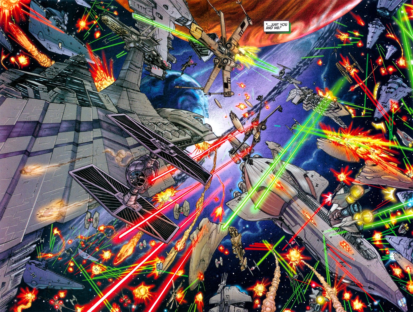

Wednesday, 12 March 2014

The Best of Milligan & McCarthy review


This is a great collection from Dark Horse. Peter Milligan and Brendan McCarthy make up one of the best long-time collaborations in all of comics. They’re not as famous as other creative teams such as Garth Ennis and Steve Dillon or Joss Whedon and John Cassaday or Stan Lee and Jack Kirby but some people would argue they should be. I’m not entirely convinced of that but The Best of Milligan & McCarthy sure makes a strong argument for it. I think the collection isn’t as much a collection of the best as much as it’s the most comprehensive collection of the creative team’s work to date. That’s the reason I bought this collection because it collects some very hard to find and out of print works from this British duo. I’ve enjoyed they work separately before but this, I think, is the first time I read one of their comics-by-collaboration.

One of the better stories collected in this volume is Paradax!. The story is quite simple; a young unemployed man finds a superhero costume in a book. When he wears the costume he discovers that he has gained the ability to walk through wall and move his body through objects. Instead of deciding out of the blue that he will fight crime and uphold justice with the help of his new powers, he decides to do something altogether different: get famous. Paradax! is an honest satire of the superhero job and it revels it’s in hipster attitude and the slacker ways in which its hero prances around town and occasionally fights crime. I quite like McCarthy’s art here. The clear line work is very effective when combined with the bright, day glow colouring. Unlike other more famous comics of the late eighties, the colours aren’t dark and muddy; they’re very bright, boldly announcing the arrival of a new hero on the streets. It’s a shame that he’s not really up to much good but he doesn’t have to. There aren’t any rules governing the actions of people who stumble upon magic costumes. All Al Cooper really wants to do is drink beer, have sex with girlfriend and strike it big in celebrity circles.

Hands down my favourite comic in The Best of Milligan & McCarthy is Rogan Gosh. It’s a masterpiece. Rogan Gosh presents the reader with multiple paths than can lead to transcendence or maybe it’s the illusion of multiple paths as there is only one true way to achieve enlightenment. Some will chose to pursue other things in life, such as love and caring for the fellow man. Others will foolishly be tricked into thinking that a life spent in an extended dream state is the same thing as enlightenment. I could go on and give you a synopsis of Rogan Gosh but that would be pointless for me and you both. Besides, it would sound like gibberish because Rogan Gosh masquerades as a comic that isn’t really about anything beyond a collage of Indian imagery and bright colours. In truth, it’s a comic that is as rich and complex as the best curry dishes. It seemingly combines a few different storylines that are all really the same stories from different dimensions (reality, dreamscape, a combination of the two, etc), all of them occurring simultaneously, commenting and contrasting with each other to give the reader a single story that echoes beyond the panels with each additional passing page.

I liked to you. I’ll attempt a synopsis. It begins with Rudyard Kipling who is in India. Having just experience a difficult time in his life and amassing bad karma, he decides to find the legendary Rogan Gosh (the man, not the dish). Rogan Gosh is a Karmanaut, a type of person who specializes in getting rid of bad karma. Kipling visits an opium house because Rogan Gosh does not live is the physical world. Meanwhile, a young man is trying to order a meal at a curry house only to end up decapitated along with his waiter. The two are now bound for the spiritual plane where they embark on a journey of enlightenment. Rogan Gosh is trick bed the god of lies and his most recent body is growing old. He patiently awaits his next reincarnation while also trying to save himself from the curse of Kali. There’s also a pretty heart-warming story of a broken love that learns to heal but that’s not all. There are even more things happening within the pages of Rogan Gosh. It’s about many things and about nothing. Rogan Gosh is best described as an experience. They weren’t just being boastful with the title; this is truly the best of Milligan and McCarthy.

The last major work included in this collection is Skin. Skin had a rather controversial publication history. It tells the story of Martin Atchison, a skinhead during the 70s in England. Martin was born with severe birth defects after his mother was poisoned because she took thalidomide to relieve her morning sickness during her pregnancy. The story is pretty straightforward, recounting a regular day in Martin’s life and his interaction with the group of skinheads he hangs out with. The story spirals downwards after he experiences a traumatic series of events highlighting how he will never lead a normal life because of his disability. It’s violent, rude and kind of a dumb comic but it’s intentionally dumb, hiding a smarter narrative and a poignant critique of larger corporations taking advantage of consumers.

The art seems regressive compared to the artwork of others comics McCarthy’s illustrated. It’s obviously intentional and I believe it was done to make the art look as dumb as the story. It’s as if McCarthy is trying to show us how Martin views the world. Everything looks a bit strange because Martin sees the world differently than others. The colouring by Carol Swain makes everything look poisoned or sick which again alludes to Martin’s birth defects. The sickly colours are applied in a brush stroke pattern reminiscent of wax crayons. It’s a very peculiar look but it works in the context of the story. Much like in Paradax!, what makes this comic good, what makes it memorable, is how brutally honest Milligan and McCarthy are with their storytelling. They present their critiques of large corporations and wealthy fat casts in an unapologetic way which isn’t only refreshing, it’s also crucial to the quality of the comic and the message of the story.

The Best of Milligan & McCarthy is a fascinating comic. It’s especially interesting if you’re familiar with the history of England during the eighties. Milligan and McCarthy really play up the satire in aloud of these comics. They really get that feel of oppression of youth and labourers and as significant as Margaret Thatcher’s time as Prime Minister has influenced culture during and after her time in office for the Vertigo line of American comics, it’s even more obvious in this collection. There is a raw energy to the comics and the satire reacts to what then was recent and immediate changes taking place in the country. These comics in this collection, which includes other shorter and less impressive works, aren’t just a visual feast, powerful satire of politics and superhero comics and ground-breaking stories, they’re all of these things combined. It’s not often that you get a chance to read comics that are historically important that also happen to be good comics and some are event great (Rogan Gosh). If you like any of these things, you owe it to yourself to pick up a copy of this book. 


Wednesday, 24 April 2013

Concrete volume 01: Depths review


Concrete is the superhero comic that could, but chose not to. I’m so impressed that Paul Chadwick deliberately chose to take his comic in a different direction. Let me explain. Concrete, I’ll call him Ron (his real name), is a seven foot tall creature with a thick skin of concrete which makes him very resistant to physical stimulus. Ron became this way after being abducted by aliens who transferred his brain into a new, concrete, body. His new body made super strong, extremely resistant, and it also gave him the ability to perform great and seemingly impossible feats for even the most extraordinary human. Sounds like a superhero origin, doesn’t it? And it is, but not quite. Well, it could have been. Ah, the more I think about it the more impressed I become of what Paul Chadwick has accomplished.  

In Chadwick’s introduction, he mentions that following his initial inception, Concrete was mistaken to be a superhero comic. People would ask him who Ron would fight next. Exactly how Chadwick was able to resist doing just that, writing a superhero comic, in the American comic industry in the 80s is beyond me. Not only that, but there is an interesting and even enjoyable environmental message that can easily be found within the pages of Concrete. I say it’s enjoyable because it feels heartfelt and real as opposed to forced and preachy like is often the case in fiction that deals with social concerns.

Concrete is a realist comic masterpiece. Paul Chadwick makes his comic a realist work by treating Ron and his exploits as if they were real. How would the government react to a concrete man who is in this state after surviving an encounter with extra-terrestrials? Would he still be considered a man? How would you give Ron his freedom without causing chaos and mass speculation from the populace? More importantly, how is Ron going to live his life? What can he do? What should he do? So many people would have written Concrete as a superhero. His origins are practically begging for it, but Chadwick decides to go in another direction and I can my express how glad I am that he did so. Ron decides to undergo several nature expeditions and write about his exploits like his childhood heroes did (I can’t remember their names but they’re famous explorers and adventurers who wrote about their exploits). To do so he hires an assistant (Ron can’t write or type with his giant hands) and they, accompanied by Maureen Vonnegut (no relations) travel to different parts of the world. 
I'm very impressed how Chadwick depicts the dark
 waters of the ocean in the middle of the night using
nothing but black ink on a white page.


I could not stop thinking of Concrete as a deliberate non-superhero work despite it being seemingly created for such a genre and in a market dominated by long underwear. Simple, real world things take on more meaning and weight than the most fantastic and imaginative superhero stories. In one of the stories, Concrete fights a bear and his thoughts are if how terribly scared he is of this common forest animal. It surprised me. Ron is huge and strong and nigh indestructible, but a bear, something arguably weaker than he is, terrifies him. In a different comic, a superhero comic, the hero would have thought little of a regular bear. Many heroes are forever changed by their powers. It's not the same for Ron. If anything his body has allowed for him to be who he really is. He's a pudgy boy who used to dream of adventures and daring do. This new body allows him to live those dreams but he does it with the sensitive approach of someone who, despite his current indestructible state, is very aware of the dangers.

There’s another example of Ron’s identity and how it’s not changed after acquiring his new body. A friend of his asks Ron to come to a nude beach with him and his girlfriend. Ron declines because it would make him uncomfortable. His friend points out that Ron, in his concrete body, is always naked. The reason he would be uncomfortable is because he feels he would be caught looking at other people's nude bodies and because he would never had done this before he became concrete giant. How Chadwick resists the temptation of having his main character resist the changes to his identity following his incredible transformation is just another impressive and surprising touch that adds a lot to the story.
Its because of pages like this one that
people thought Concrete was a
superhero comic.
More strange science fiction. Somehow
Chadwick makes it fit with the realist
tone found in the rest of the series.


One of the things that greatly contribute to Concrete being so good is that Chadwick’s art is very good. Not only does he have a strong grasp on the narrative flow of a comic book page, he also has a mesmerizingly good realist art style. The art is all in black and white. Some people have a difficult time reading black and white comics but I don’t mind. I prefer to read a comic in whichever format it was originally intended. I’m not a fan of older comics being recolored for a new printing or of coloured comics being printed in black in white. Here, the art is characterized by the stark contrasts between the white page and the black ink. You’re guaranteed a stunning panel or even an entire page every few pages you turn. A particular moment, when Ron is swimming in the Atlantic at night surrounded by phosphorous plankton, is absolutely stunning. Chadwick’s realist style captures the beauty and mystery of nature as well as it captures the facial expressions and body language of his human (and concrete) characters. At his best, Chadwick’s art reminds me of the Hernandez Brothers, Jaime and Gilbert, of Love and Rockets fame. This is high praise since the Hernandez brothers are some of my favourite artists. At worse, however, his art still shows a young artist learning the subtleties of his craft.

This comic is for everybody. It’s for superhero comic fans that are looking to shake things up a bit. It’s for avid comic readers who don’t limit themselves to certain publishers or genres. It’s also for people who generally don’t read many comics at all. There’s something here to please every type of reader. I only have suggestion, take your time, savour it, because before you know it you’ll be looking at the last page of the book wishing the second volume was close at hand so that you could continue reading Concrete. 
Not only is this a great image on it's own,
it also demonstrates Chadwick's skill as a writer.


Concrete isn't Superman. He's can be hurt,
his leg get be nearly completely blown off.