Showing posts with label comic review. Show all posts

Wednesday, 3 February 2016

Naruto 3-in-1 11 (volume 31-32-33) Review

I owe a lot of thanks to the person at Viz Media who thought of collecting some of their popular, multi-volume manga into these delightful omnibus editions. It works so well for shonen manga and I’m sure that even non-shonen manga read well in this format. More manga for less money! What’s not to love? Well, if you’re talking about this particular 3-in-1 volume of Naruto, there is one thing. One character, to be exact, but I’m getting ahead of myself.

The opening volume to this omnibus, volume 30, includes the final few chapters of the Kazekage Rescue Mission arc. Sakura and Granny Chiyo are fighting Sasori, one of the Akatsuki’s members. With this fight, Masashi Kishimoto has given readers multiples examples of the kind of jutsu and attacks that puppet masters wield in battle. Seeing the experience of Granny Chiyo’s mastery of puppet jutsu used against the powerful and inventive puppet jutsu of her grandson, Sasori, is very enjoyable. Throwing Sakura in the mix and having her show off her surprisingly strong physical attacks simply adds to the enjoyment of this fight and this story arc. It’s also a good showcase of Sakura’s new abilities. This is the first time we see Sakura fight following her training with Tsunade and it’s impressive. I find that Sakura has been grossly underused in Part One and it’s nice to see her get some much deserved attention here. It’s very successful and make for a few great. She’s fearless compared to the younger Sakura we used to know. In this fight she proves to be strong, resourceful, and a commendable team player.

Wednesday, 27 January 2016

"The family circle is a triangle": Stray Toasters review

Bill Sienkiewicz (pronounced sin-KEV-itch) is a masterful artist. Some of his works in comics rank among my all-time favourites. His collaboration with Frank Miller on Elektra: Assassin and Daredevil Love and War are some of the most memorable and masterfully told comics I’ve ever had the pleasure of reading. His career is filled with milestone issues in some of the most popular titles. His style of art incorporates many types of artistic techniques resulting in a unique and immediately identifiable style. Having Sienkiewicz inking another artist’s pencils is enough to give a comic a stylish vibe. His influence is huge and I’m sad it took me so long to read Stray Toasters which he wrote as well as illustrated.

Anybody who’s even flipped through a copy of this comic can attest to its strangeness. While I can say without any reservations that I love his art, I can’t say the same for his writing. When I consider it, there are some similarities between his approach to art and writing and while it suits one, it doesn’t suit the other. The energetic and chaotic art style doesn’t translate well to the written word. Stray Toasters is incredibly confusing and out of that emerged my frustration as a confused reader.

Wednesday, 2 December 2015

Star Wars Omnibus: Clone Wars Volume 1: The Republic Goes to War Review (Unread 033)

I’ve written before about Dark Horse’s Star Wars comic omnibus collections. They’re pretty great. They’re designed to collect novel length stories and smaller stories that otherwise wouldn’t be collected anywhere else. I really like them because they’re huge and quite affordable. This volume is over 400 pages long. For the most part, these omnibus volumes include numerous issues all tied to a theme or a series or a time period. This one, obviously, is set during the Clone Wars. Particularly the beginning of the Clone Wars shortly after the events of Attack of the Clones.

A very large number of issues are included in this volume. Unfortunately, I will not list all of the creators involved because I’m lazy. However I’m pleased to announced that Dark Horse meticulously listed all creators at the beginning of each story. For this collection that meant almost every new issue. Most of the comics in this volume are short stories of approximately two issues in length (all the Jedi one-shots are double sized issues). Here are the contents of Clone Wars: The Republic Goes to War:

Wednesday, 21 October 2015

Moon Knight: From the Dead Review (Unread 028)

I’m a huge fan of Warren Ellis. He’s undoubtedly one of the comic book greats. I love his writing for many reasons but I’d like to focus on just a few in this review because they tie into what made Moon Knight: From the Dead such a fantastic comic.

Warren Ellis is very skilled at revitalization old properties. He’s also good at taking familiar concepts or characters and giving them new life. There are other skilled creators from Ellis’s generation that are also good at this, but it doesn’t take away from his ability to do it and to do it well. A few examples of this would be the work he’s done with Doom 2099, Stormwatch and The Authority, and the work he’s done on the X-men franchise. He’s also had quite a bit of success doing this in Marvel’s Ultimate line of comics with titles such as the Ultimate Galactus Trilogy, Iron Man, Ultimate Human, and Ultimate Fantastic Four.  

It’s no surprise then that he revitalizes Moon Knight in a subtle yet meaningful way. It seems so simple and simplicity is another characteristic of some (not all) of Ellis’s work. All he does it boil down Moon Knight to a few core elements, to his core essence. He doesn’t needlessly revise the characters origins or give him an unnecessary cast of secondary characters to support the main character. He doesn’t drag it out into a bloated decompressed character revamp 12 issue maxi series either. He focuses on a few ideas, the strongest ideas, and structures the story around that to heighten the impact of the character and the story. He doesn’t overuse his ideas nor does he throw in more ideas than is necessary or functional. He avoids diluting the narrative in exchange for potency. This leads us into the second reason why he is such a great writer.

Thursday, 15 October 2015

The Avengers: Assault on Olympus Review (Unread 027)

My edition of The Avengers: Assault on Olympus is a hardcover from the Marvel Premiere Classic line of reprints. It’s super expensive but luckily I bought mine for 50% off. I have no idea why Marvel charges so much for reprints of old comics. It seems wrong somehow as well as counter intuitive. Why check out old comics when it’s cheaper to buy new ones? Then again, new Marvel comics aren’t cheap either. Either way, if you can find some of these old reprints for cheap, either in discount bins or 50% off shelves, grab ‘em. They’re almost always a treat. Even when the comics are bad it gives you an idea of what they were like back in the day. That’s always interesting. If you get lucky, you’ll end up buying a comic as good as this one. I’ve only ever read one comic by Roger Stern, Doctor Strange and Doctor Doom: Triumph and Torment and that was an excellent story. Clearly I’ve been missing out the Stern goodness because Assault on Olympus was also pretty great.

All of the issues in this collection were written by Roger Stern with exception to issue# 280 which was written by Bob Harras. Likewise John Buscema and Tom Palmer illustrated all of the issues except for #280 which was drawn by Bob Hall and Kyle Baker. Christie Scheele coloured most of the stories and Bill Oakley did the bulk of the lettering. These are all familiar creator names for anybody who has read Marvel comics from the 1980s. This is a solid creative team and it shouldn’t have been surprising as to how good these issues were.

Wednesday, 12 August 2015

Fantastic Four Visionaries: Walter Simonson volume 3 review (Unread 019)

I’m a fan of Marvel’s Visionaries series. It can still be hard to find old comics in affordable trades (though it’s easier now than it’s ever been) and the entire reason for being of the Visionaries line is to provide readers with a chance to discover classic runs by popular creators. While they tend to focus more on collecting runs by one particular writer, artists aren’t left completely in the dark as there are a small handful of volumes that are popular because of the artists. It’s sad to see that so many of these volumes are currently out of print but they can still be purchased easily enough at conventions or online. Regular readers will know that the latest Visionaries title I’ve been reading has been Fantastic Four Visionaries: Walter Simonson volumes 1-3. It’s taken me a long time (9 months!) to read them, even though I’ve enjoyed every volume. That’s because my general reaction has been one of passive enjoyment. They’re good issues, certainly, and I like Simonson as s writer and as an artist, but there hasn’t really been anything to make me give the run overwhelming praise.

This volume is split into two stories. The first is the best and one of the better stories of the entire run. Issues #347-349 are written by Simonson with pencils by Arthur Adams, penciling assists (issues #348 and 349) by Gracine Tanaka, inks by Art Thibert and Al Milgrom, lettering by Bill Oakley, colouring by Steve Buccellato, and edited by Ralph Macchio.

Wednesday, 1 July 2015

Star Trek: The Next Generation Omnibus review (Unread 013)

IDW Publishing, the current comic book publisher which holds the rights to Star Trek comics has put together a few archive collections of Star Trek comics previously published by other companies. They’ve also put together omnibus editions that collect multiple mini-series that were first published by IDW. It’s a good publishing strategy as mini-series are often overlooked by regular comic book readers and considering that most of IDW’s Star Trek output has been in this format it makes sense to give those minis a wider audience. Since the omnibus collections contain multiple mini-series at a more affordable price, it’s most likely the favoured choice of potential buyers. That’s why I bought this volume. The page per dollar ratio makes it worthwhile purchase. This volume focuses on stories set in The Next Generation series. Four miniseries are collected together. The first of which is The Space Between.


The Space Between
Written by David Tischman
Art by Casey Maloney
Additional Inks by Stacie Ponder and Aaron Leach
Colors by Leonard O’Grady
Letters by Robbie Robbins, Chris Mowry, and Neil Uyetake
Edited by Dan Taylor

Wednesday, 28 January 2015

Wolverine and the X-men vol. 8 review (Unread 006)

This is it. This is the volume of Wolverine and the X-men I was waiting for. Volume 8 collects Wolverine and the X-men Annual #1 and issues #38-42. This is the last volume of the series before it got rebooted and it’s the best volume of the series since the first two volumes. With this final volume the Jason Aaron and the artists demonstrate once again what the series is about. It’s also nice to be able to look at the series as a whole. After concluding my reading of Wolverine and the X-men it is clear to me that the series is yet another example of how the modern climate of superhero comics negatively affected the quality of this and other comics.

Wolverine and the X-men has been disrupted by event storylines on three occasions. Several issues where spent telling tie-in issues to Avengers vs. X-men, two issues completed wasted as part of the X-men: Battle of the Atom event, and finally the annual issue was linked to the events of Infinity. Thankfully for two of these events (Avengers vs. X-men and Infinity) Aaron was able to tell engaging stories despite editorial requirements to make his story work in tandem with the larger story of the Marvel Universe. The downside is that it completely undermines any momentum the series had built at the time the event storylines intruded.

Sunday, 25 January 2015

Wolverine and the X-men vol. 7 review (Unread 005)


I’ve mentioned before how I really like Jason Aaron and that makes it all the more disappointing that the volume 7 of Wolverine and the X-men is probably the lowest point of the entire series. It’s a shame because for a while Wolverine and the X-men was the best X-men title at Marvel. With X-men: Schism in 2011 Aaron was spearheading the line and thanks in part to his efforts and the efforts of many other writers it was an exciting time to be reading X-men comics. That was true for almost a year. By the time the Avengers vs. X-men comic around, Wolverine and the X-men along with all the other X-men titles were pulled into a companywide event. The stories radically shifted focus but Aaron was still able to write interesting stories, despite the Marvel Universe’s new direction.

It wasn’t all bad though. Since the series written by Aaron wasn’t the only one affected it still remained the most enjoyable and consistent X-men comic. When I reviewed volumes 5 and 6, my enjoyment was based on the return to form following the interruptions Avengers fighting X-men and nobody being really satisfied with the event. The downside to those volumes is that you could easily sense that Aaron and his team of artist were working hard to rebuild the momentum the series had lost during the event. It’s great that they were doing so but it also made those volumes feel like they were laying the ground work and everybody was holding back a little. At the time I hypothesized that the series was building towards a big storyline which was meant to pay-off on all the subplots that were building since the first issue.

Wednesday, 21 January 2015

Fantastic Four Visionaries: Walter Simonson volume 2 review (Unread 004)

When I read the first volume of Fantastic Four Visionaries: Walter Simonson I went in with some pretty high expectations. I wasn’t quite expecting something as good as his legendary run on Thor but I was still hoping to find a comic that was really worthy of the Visionaries title it was given. I’ve read of few collections in Marvel’s Visionaries line and they’ve all fluctuated quite a bit in quality. For the curious at home I’ve read Frank Miller’s run on Daredevil (excellent stuff), Alan Davis’ more or less solo run on Excalibur (quite good but degrades in quality with each volume), and Peter David’s first run on X-Factor during the 90s (plays around with some neat ideas and is mostly memorable for one amazing issue, the rest is basically exactly what you would expect for 90s era X-men). In terms of quality I would place the first volume of Fantastic Four Visionaries: Walter Simonson between Alan Davis on Excalibur and Peter David on X-Factor. It was good but nothing exceptionally noteworthy in terms of superhero comics. The second volume, much to my delight, is an improvement on the first.

It might help that I went into the second volume with lower expectations but the fact is Walter Simonson impressed me a little. He continues the story form the first volume not by giving you more, but by giving you less. The excess and decompression of the time bubble story was the cause of my disappointment with the first volume. With the second volume, Simonson tells two stories related to the Fantastic Four’s adventure in the time bubble but they’re shorter, more tightly focused stories that somehow also managed to be very fun and enjoyable without ever being juvenile. I would also argue that Simonson’s art is more interesting here than in the previous volume. All in all, volume 2 which collects Fantastic Four issues #342 to 346 suggests that Simonson’s run on Fantastic Four might just be worthy of the Visionaries title it received. I’ll have to read the third volume to in order to be certain.

Wednesday, 17 December 2014

Star Trek: The Newspaper Comics vol. 1, 1971-1981 review


Did you know there once was a Star Trek newspaper comic? It’s true. Around the time of the release of Star Trek: The Motion Picture Paramount launched a daily newspaper comic chronicling the further adventures of the Enterprise and her crew. The daily strip was set during the timeline of the movie, rather than being set during the time of the original television show’s run. It’s very likely that this was done in order to make the daily strips more marketable and relatable to late 70s and early 80s Star Trek audiences. Having launched at the very end of the 70s and just a few days before the release of The Motion Picture it made sense that the comic strip would tell new stories of Captain Kirk, Spock and McCoy.

This volume collects the first half of the US strip produced by Los Angeles Times Mirror Syndicate. There was also a UK strip which remains uncollected to this day but Rich Handley, who wrote the introduction to this volume, has collected the US and UK strips. He’s responsible for initially bringing this project to Dean Mullaney, the editor of IDW's The Library of American Comics imprint, which resulted in the two volume collection of the entire US newspaper comic. Handley is looking to have the UK strip collected as well but it’s unclear if this is a project that Mullaney and IDW are actively working on.

The Star Trek comics strip debuted on December 2, 1979, just a few days before the release of Star Trek: The Motion Picture. It did not have a long life as it ended on October 25th, 1981. There are two primary reasons for the short lived existence of the strip. The first is that the young Star Trek newspaper comic had to compete with classic series such as Buck Rogers and Flash Gordon which had both been in print for decades. There was also a newer rival as Star Wars was also being distributed as a comic strip. There was simply not enough of a fan base to allow for all those various titles to survive in the newspaper landscape. The second reason is that Star Trek received rather poor circulation in newspapers in the US.

There are lots of picture in this post and I have to apologize for the quality of the images. I didn't want
to damage the book on the scanner. I'm starting with this picture because it's a simple image that is
well executed. I like it. 

The upside, of course, is that a publisher has finally collected the strip in its entirety and reproduced it for a new generation of fans. Using Handley’s private collection as well as many others that IDW could get access to (purchased and borrowed), the publisher was able to put together yet another stellar collection as part of their The Library of American Comics imprint. They’ve done a very successful job putting together many collections of classic and influential comic strips and while I’m not entirely certain that Star Trek: The Newspaper Comic deserted such a prestigious reproduction it’s nice to know that IDW continues to produce some of the best archival comic book collections. 

Artist Ron Harris adding some dynamic action in a Sunday page.

I recently sat down and read the first volume and I had good time but it was also a very frustrating read, mainly because of the nature of Star Trek stories and the format of daily newspaper strips. In short, I just don’t think that Star Trek lends itself well to the format. While my overall impression is a negative one there were still some rather impressive illustrations by writer/artist Thomas Warkentin. His drawings were, hands down, some of the best things about this book and it’s unfortunate that some strips simply look better than others because of how well they were able to be reproduced. It reminds you that this truly is an archival project and for that element alone I like this book. Yet none of that really matters if you’re looking at the quality of what’s being reproduced and that’s where even Warkentin, who is without a doubt the best writer and artist of the strip as far as this collection goes, fails to deliver a completely satisfying set of stories.

The first sample of many terrible alien designs to come. Those
things like kind of look like scarves? Arms.

This is a closer look at their faces. They're essentially big, cartoony eyes
with what appear to be a series of neck flats for mouthes. Just nasty and boring.

He certainly has a knack for writing dialogue that feels true to the character and harkens back to the actors’ performance on the original television series. Unfortunately, convincing dialogue and to-the-point storytelling, even when well done, it’s enough to carry the book. The main problem is the format of the newspaper strip. The structure of the comic strip is very simple. Monday through Saturday saw the single strip which is often made up of about three panels. Sundays consisted of a full page in colour. The problem is that three panels a day just isn’t enough to make for a satisfying Star Trek story. It has a choppy rhythm that is ultimately disruptive and breaks any momentum that the creative team can possible build in three-panel doses. The longer Sunday strips are good for building momentum but they’re undermined every Monday by a three-panel recap strip to reintroduce readers who don’t read the Sunday paper back into the story.

Another full page but this time it's with art by Warkentin and it's made up of daily strips.
Notice how it's mostly made up of talking heads? Just riveting stuff.

The comic strip brought with it the writing credits of well-known writers and artists. The most famous contributor to the comic was Larry Niven, famed science fiction writer and Gerry Conway, celebrated comic book illustrator. Unfortunately I did not get to read any of the stories by either of them as the first volume mostly collects the stories written and illustrated by Thomas Warkentin, the first person to work on the comic strip. He held the most reliable and sustained tenure on the title. He left after completing eight complete stories from the first daily in 1979 to 1981 after which he was followed by several other writers and artists. Based on the last two stories that are feature in this collection Warkentin was likely representative of the best stories the newspaper comic had to offer as the stories that followed are of a lesser quality. A lot of that has to do with the art though as Warkentin’s style was cleaner and more precise than that of the artists who drew the last two stories in this volume.

This is the first half of one of the earlier Sunday pages. I just love the red suits
with jet packs which Warkentin took from The Motion Picture. Great stuff from early on.

That being said there could very well be nice surprises in the second volume but I will probably not find out anytime soon. The reproduction of the strip was expertly handled by IDW but that also results in a high sticker price. The books, even when purchased at online bookstores, are a little too expensive for my tastes. I enjoyed reading Star Trek: The Newspaper Comics but not enough to cough up the money for the second volume. The biggest deal breaker here is the format of the comic strip. It simply doesn’t work well enough to justify spending money on the second volume. The newspaper comic format has such a bit impact on my reading experience that I wasn’t able to read this book from cover to cover. It took weeks to read in its entirety because I would sit down on weekends or evenings and read one story at a time. The narrative flow was too erratic and choppy that I wasn’t able to immerse myself in the stories being told, no matter what a particular story was about or how much I enjoyed the art.

Here's another terrible alien design. These poor bastards don't
even have eyes!

It’s fitting that IDW gave this newspaper comic the prestige treatment as they’ll most likely attract the attention of lifelong and diehard fans of the franchise. The stories (their format, execution and reproduction, and price) are not for the occasional fan of the movies or some of the television series.  The comic strip will likely only be loved by those who have watched and rewatched all the movies and (at least) all of TOS. A lot of what makes Star Trek enjoyable, including the enhanced visual effects of the movies (in comparison to the television series) and the soundtracks, are obviously not part of the reading experience but it’s also missing the momentum and the Act structure of the episodes.  For the most part this is a “talking heads” comic and while that’s pretty true to the TOS episodes at least on the TV series you could see the characters inhabit the fantastic setting of the Enterprise’s bridge. The TOS movies were able to expand on the visions of the original series and it’s unfortunate that the strip, intended to attract the same audiences as the new movie, doesn’t have any of the gravitas of its theatrical counterpart. Likewise, the format itself presents a clear disadvantage to readers compared to other available Star Trek reading material at the before, during and after the original publication of the newspaper comic. I’m thinking primarily of other comics by Gold Key and Marvel Comics but paperback novels were also widely available at the time. I’ve read Star Trek in all three of those formats and the comic strip is the clear loser in nearly all categories.


Before buying this comic you must ask yourself how big of a Star Trek fan you are. Not in order to brag about it or to compare yourself to other fans (doing that will only prove that you’re an asshole) but in order to determine just how likely you are to enjoy this collection of newspaper comics.

Mushroom head aliens? Yes. Only in Star Trek, unfortunately.

Mudd cameo. It's difficult not to love these panels. 

I'll end it here with a great illustration of the Enterprise by Warkentin. 

Sunday, 14 December 2014

Superman for All Seasons review


Jeph Loeb and Tim Sale have done a lot of work together. I’ve had the pleasure of reading a lot of their collaborations (though not all) and I’ve enjoyed them to varying degrees. The more recent book of theirs that I’ve read is Superman for All Seasons and I really like it.

I was expecting something similar to what he did at Marvel with their origins stories for Daredevil and Hulk. That’s not exactly it. It’s also different form their work on Batman which focuses, more or less, on telling mysteries set Gotham that used many of the main cast of characters from Batman stories. Superman for All Seasons begins with Clark Kent’s late adolescence and tells the story of his first few years as Superman. It’s not an origin story, not really. Nobody even mentions Krypton. It’s more of a story about Superman than a Superman story. I’ll do my best to explain that but let’s backtrack a little.

I’m not a huge fan of origin stories but hey are necessary to have for characters that live in a serialized medium like comic books. Knowing a character’s backstory, their very beginnings, helps to define a character. It gives them motivation and it helps the reader better understand why a character does what they do. The problem I have with origin stories is that some people feel it’s important to retell them over and over again. Reimagined origins or retelling with the purpose of focusing on a specific aspect of the character that was at best loosely defined before or at worst tacked on to the character later on in order to modernize them or make them more accessible to a new generation of readers. Personally I think it’s annoying as hell to have new original stories for some of the most popular superhero characters every few years. Batman and Superman have probably had more versions told of their origin stories than any other superhero characters.

I haven’t read Superman for All Seasons until now because I thought it was going to be another original story. I gave in because I felt like reading a Superman story and I hadn’t read this one yet but mostly I picked it up because of Tim Sale’s art which I really like. I like the way he draws Clark Kent and Superman. He convincingly makes them look like different individuals without giving them different body shapes or giving one different physical attributes than the other. His Clark Kent is wide and solid looking. He’s big but Sale gives him delicate features which makes him boyishly handsome while also giving him an air of friendliness and approachability. He convincingly illustrates the alter egos of Clark and Superman. Clark wears clothing that is a little loose which retains his bulky look without giving him muscular definition. His glasses accentuate his innocence and friendliness. When he’s Superman, his costume is tight, which serves well to show off his muscles which immediately gives him a strong presence. Without his glasses his eyes are drawn to be very squinty but it’s done in a way as to make him more threatening. This doesn’t always work because his features are still drawn rather small for the size of his body, particularly his face, but in doing so Sale maintains an air of approachability while also giving him a bit more menace (he’s a crime fighter after all).


Sale didn’t disappoint with his work on this book. It helps that Bjarne Hansen did a wonderful job with the colouring. The entire book is given a classy painterly look. The colour palette is nuanced and soft but it does so without becoming lifeless, stiff or muddy. Sale’s art is usually very clear, even when he uses a lot of black shapes. With Superman, compared to his Batman work, there are very few pages with heavy inks. Instead there are clear lines, well defined shapes but it’s Hansen that gives the art its depth. He grounds the characters into the background and he helps to sell the double-page spreads throughout the book of which there are many. One of the tricks Hansen did in the comic that I like was using slightly flatter colours for the superheroic elements of the story, like Superman’s costume or Lex Luthor’s robots. The bright colours contrast with the painted colours used throughout the book and the effect is to make all the superhero stuff leap off the page. It’s quite a pleasant and effective colouring technique.

While the art was good, even better than I was expecting, partly because of Hansen’s colouring, the story is what made this comic so damn good. I previously said that this comic isn’t a Superman story, it’s a story specifically about him and that’s the great idea that gives the comic its thematic weight and separates it from so many other Superman comics.


People say that Superman is different from other super heroes because his “real” identity is that of his super-powered identity, not his human identity. I think that depends on who is writing Superman. Some people say there are two types of Superman stories: those that focus on the man and those that focus on the super. I would say that this particular story focuses on the man. In writing Superman for All Seasons Loeb focuses on the man, specifically he focuses on the idea that Clark Kent becomes the hero of Metropolis because of the nurturing and care given to him by Jonathan and Martha Kent who found him in a rocket ship when he was still a baby. With this comic, Loeb argues that its nurture, not nature, that helped shaped Clark into a heroic figure. By doing so, he’s also clearly establishing his Superman story as one of those that focuses specifically with the man.

As you might have guessed from the title, Superman for All Seasons is divided into four chapters, each one dealing with a particular season. Each chapter is also narrated by an individual close to either Clark or Superman. The narrators and chapter pairings are: Spring/Jonathan Kent, Fall/Lois Lane, Summer/Lex Luthor and Winter/Lana Lang. The Spring and Winter chapters focus on Clark and how the emergence of his superpowers have affected him and the people from Smallville that are closest to him. The Summer and Fall chapters focus on the Superman identity and how it has affected the city of Metropolis and some of its key individuals. I think that the Spring and Winter chapters are the highlights of this book as Loeb succeeds to make Clark’s fantastic emotional turmoil relatable and believable.


Loeb makes his themes and his approach to Superman’s story quite clear in the first issue. In a scene beginning with Clark and Lana are walking around in Smallville the narration by Pa Kent reads:

Sometimes, when the corn was planted, it shot up to soon. / The roots hadn’t taken hold, so the stalk couldn’t support its own weight. / The corn would turn sour. / I don’t know if Clark knew how lucky he was growing up in a place like Smallville.

The narrator is comparing a stalk of corn to Clark. Being raised in a small town like Smallville has given Clark the time to set down roots and to become morally grounded. Doing so will make him stronger later in life after he’s “shot up”. The analogy here is likely making reference to moral roots, being raised in a small town has given Clark a specific perspective on life. It’s immaterial and doesn’t focus on financial wealth. Instead, it focuses on family, being kind to others, and finding happiness in small comforts. There is also a link with Clark’s emotional maturity and the development of his powers. It’s telling that his superpowers emerge at the end of his teenage years. By that time in his life he’s already learned the lessons that will guide him in using his power in a responsible way. Certainly there is a learning curve but for the most part the foundation was strong and so he eventually learns how far he will go in using his powers.

Another clue as to what this narration can means can be found in Sale’s dedication in the trade paperback. “For Norman Rockwell and his love of a vision of Americana that resonates through its limitations” Many of Rockwell famous paintings and illustrations highlight a simple way of life. His work is underpinned by core American values which were often sentimental and idealistic. He offered a vision of America that was simple yet complex, evocative, and thoughtful.


 The mention of limitations is linked to the story being told in the second half of Superman for All Seasons. After a confrontation with Lex Luthor, Superman learns that despite all of his powers there are certain things he simply can’t do. He’s superhuman but he’s not omnipotent. This is an important element of his character because the knowledge that he cannot do everything and anything means he, like all of humanity, is required to make choices. He’s had to learn to live with larger than life powers and then he had to learn that his choices as a super-powered being will have larger than life consequences.

While it’s not stated in the text as a part of this story, I also like to think of limitations as being an integral part of Superman. As a being that is so incredibly powerful he’s constantly a danger to normal people around him. Losing his temper could accidentally result in large scale destruction and potentially thousands of deaths. How does he interact with the rest of humanity when he’s Clark Kent? In order to function normally he has to suppress his impressive gifts. Many of Superman’s limitations are self-imposed. Limitations in the use of his power, both in what he is willing to do with them and in how much strength he uses in everyday situations. He does this in order to prevent himself from abusing his powers and hurting others.

This brings us back to his Clark Kent identity and the idea that Superman is his “true” identity. I completely disagree with this idea of a “true” identity. Superman is a complex character and you could argue that Clark Kent has existed far longer than Superman. Superman is a construct of Clark’s that allows him to use his powers while maintaining a life in which he can, as Clark, live like a man. This is another form of self-imposed limitation because it shows that Clark is not willing to fully embrace, on a permanent basis, the identity of Superman. He wants to maintain his connection to humanity and the best way to do that is to continue being part of humanity. Clark lives a human life in order to continuously provide his Superman identity with moral and intellectual guidance.


Loeb and Sale wanted to write a Superman story that lent itself well to large panels, many double-page spreads. They certainly succeed at that. The large panels and the overall decompressed aspect of the writing and the art really help to give this story resonance. Superman for All Seasons is a contemplative work and by keeping the focus tightly on Clark’s development into his new identity as the hero of Metropolis  the creative team succeeds at giving their book the thematic resonance they were attempting to achieve. I particularly liked the use of narrators that gave an outsider’s point of view of Clark’s struggle in cementing his identity as Superman. 

Sunday, 7 December 2014

Realism, Hope and Optimism in Warren Ellis’s Ocean: A Review


Warren Ellis is the best writer of science fiction stories in all of comics. There, I said it. I mean it too. His comics are regularly intelligent and well-paced. He’s very skilled at taking big and sometimes complicated ideas and simplifying them enough to make them easily digestible. He manages to do this (exactly how, I don’t know) without dumbing it down or changing the idea to fit the story he’s trying to tell. Instead, he uses scientific ideas as the starting point for his stories and builds the rest around it. His entire comic book writing career has dealt with scientific ideas whether or not he’s writing a strictly science fictional story. This style of writing is often paired with a large dose of realism all of which gives his writing a very specific flair.

In order to understand Ellis’s approach to writing science I need to give a quick overview of two important movements in comic books: revisionism and reconstructionism. The 1980s saw the emergence of several highly regarded mature comic book works such as The Dark Knight Returns and Watchmen. Their impact on the comic book industry was a nearly immediate attempt to recapture the same feel of those comics but it was done so by creative teams that lacked the crucial understanding of those influential works. Comic books of the early 1990s were plagued with what is now known as the “grim ‘n’ gritty” aesthetic. Writers and artists would try to emulate the harsh realisms and brutality comics such as Watchmen only to end up with senseless violent and poorly thought-out comics of their own.

What made those critically acclaimed mid-to-late 1980s comics so good was the use of realism in telling in storytelling. By adding social, political and real-world physics to comics the revisionist movement was born. This use of intelligent storytelling was often combined with experimental narrative techniques. The Dark Knight Returns used a 16-panel grid as the basis of every page while Watchmen did the same with a 9-panel grid. Both works also considered the realistic implications of having superheroes. In The Dark Knight Returns this is mostly apparent in Frank Miller’s use of news media while in Watchmen Alan Moore took superheroes as the foundation for his world building of an alternate America. Taking fanciful ideas and treating them with the utmost seriousness and concern for verisimilitude was one of the driving forces behind such revisionist works.

After the many failed attempts at recreating revisionist comics a second movement was created with the release of Marvels by Kurt Busiek and Alex Ross in 1994. This movement, called reconstructionism, had the intent of recapturing the wonder and awe of superhero comics which used to inspire them as young readers. This wasn’t just a return to form for superhero comics. Instead, it was a counter movement to revisionism since it kept the intelligence of revisionist works while imbuing them with a more hopeful tone. I must point out that revisionist works like Marvels and Busiek’s later series Astro City weren’t simply about having fun with superhero comics. They had emotionally potent and often literary stories to tell but they did not shy away from using highly fictitious elements (superheroes and pseudo-science, primarily) in their stories. They were not concerned with the often stark portrayal of reality that was often found in revisionist comics.

You might be wondering what any of this has to do with Warren Ellis. His comic book writing career began in 1990. By 1995 he wrote a companion comic to Marvels called Ruins where he presented highly revisionist and scientifically accurate (at least in theory, we do not have real superheroes to provide any additional prove) depictions of various super-powered beings in the Marvel Universe. He presented Invisible Woman as being blind when using her invisibility powers since her eyes new longer interact with light correctly (I apologize for being vague or inaccurate on this point, it’s been a while since I read Ruins). Wolverine is the victim of adamantium poisonings, the Hulk is essentially a walking tumour, etc. Rising to fame as an important and skilled comics writer during the nineties would result in Ellis’s entire career dealing with aspect of both revisionism and reconstructionism in his work.

Warren Ellis used a realistic approach in his science fiction writing which often brings him to deal with revisionist motifs. Yet, Ellis is also quite capable of including reconstructionist ideals in his stories, too. A lot of his superhero comics are characterized by his realistic approach to science in his stories while also employing a sense of wonder and awe to the science and his storytelling. A lot of that has to do with the tone of a specific story. Ellis is as capable of writing a revisionist work at the same time that he is writing something purely reconstructionist. He’s a an oddity amongst comic book writers since he’s written series that combines the style and content of both movements into under one title, with little or no narrative and storytelling conflict. Planetary is probably the best example of that.

Both these movement are tied to superhero comics (for the most part) it’s difficult to apply them directly to his non-superhero work. Most of his non-superhero work is science fiction and since a lot of superhero comics are a sub-genre of science fiction you can see echoes of revisionism and reconstructionism in his science fiction comics.

Warren Ellis deals with hard sciences and near future science fiction. Some of the very first lines in his Wikipedia page say that he “is well known for sociocultural commentary, both through his online presence and through his writing, which covers transhumanist themes (most notably nanotechnology, cryonics, mind transfer, and human enhancement).” Sometimes I think his mind lives in the near future while he body occupies the same time and space as the rest of us which allows him to write so convincingly and intelligently about complex ideas that have their roots in the sciences (social, technological and natural).

Those are some of the thoughts that float in my head each time I read a comic by Ellis. This is what I had in the back of my head when I recently reread Ocean, a single volume science fiction story by Ellis with art by Chris Sprouse and Karl Story.

Ocean’s plot is pretty straightforward. Set 100 years in the future, United Nations Weapons Inspector Nathan Kane travels to a space station named Cold Harbor in rotation around Europa, one of Jupiter’s moons. A significant yet highly secretive discovery has been made in Europa’s ocean. A very large number of coffins are submerged under the planet’s icy surface, along with weapons that are capable of destroying planets. Kane’s been asked to investigate and, if need be, take action to ensure they’re not put into use by individuals with nefarious goals. It would have been a simple mission if the Doors corporation didn’t also have a station in orbit to make things complicated, and highly dangerous, for Kane and the scientists of Cold Harbor.

What makes Ocean an engaging and worthwhile read isn’t the plot. That’s actually rather run-of-the-mill. What’s truly wonderful is the tone which conveys a great sense of respect for other cultures, humanity’s future and the scientific ideas that Ellis is playing with. A big part of the tone is established by the clean and very precise art of Chris Sprouse. He’s aided by regular contributor Karl Story who handles the ink. Ellis’s distinct pacing allows Sprouse’s page layouts to be very cinematic. He also gives the interiors of the space ships and space stations are surprisingly open, almost breezy, feel.


The rest of the tone is the result of Ellis’s writing choices. Consider his charactesr. Nathan Kane, the lead protagonist, is a black man. Something we don’t often see in comics today, let alone ten years ago. Three quarters of the crew at Cold Harbor’s crew are women, professionals in their field of study. They’re skilled and intelligent but they’re also quirky (without being stereotypical) and unique. All five main characters accept and respect the people with whom they work. This isn’t the focus of the story but it anchors it and gives the story weight and meaning. Ellis builds his story starting with the science, continuing with characters and leading to the story. That’s the formula to a lot of his work. He does this while celebrating a great deal of positive things and without ever making it a sickly sweet read. We have his English wit to thank for that, I’m sure as the dialogue is filled with snark and sarcasm.

Ellis doesn’t shy away from showing you a potential future where conglomerates have delved deeper into their invasions of our individual rights and privacy for profit. He won’t hesitate to craft a story in which humanity’s roots are discovered to be a long-dormant humanoid species from the same solar system that lived to kill and destroy. In essence, he doesn’t pull his punches. He will show you the worst of mankind in most of his work but this is counter-balanced with his compulsion to show you the best of mankind. He’s cautionary as well as being hopeful. It’s all incredibly humanistic. Even the figurehead of the Doors corporation in Ocean is sympathetic in his own way. He’s delusional, sadistic and hysterical, absolutely, but also a sad and pitiful man that you’re made to understand is only trying to make the best of a very, very situation. 


It’s clear that there are some revisionist elements in Ocean, particularly the realism of the technology of space flight. The science also includes the rather interesting idea of guns designed to be safely used (for the shooter, not for the intended target) in a space station or ship. The action piece in the last issue works wonders with artificial gravity and atmospherics within the station. Despite all of this, I would argue that Oceans has more in common with reconstructionism because of the comic book’s overall tone. It’s inherently optimistic. Certainly the Doors company is a frightful look into our potential future but the organization is defeated by a small group of five intelligent individuals. The comic remains hopeful and positive in face of the clearly evil and equally realistic villains (one group of villains acts more as an allegory of our past errors than as actual murder-obsessed ancestors to humanity) of the book.

The book’s main theme is to supplant positive aspects of humanity over negative ones. The Doors manager wants to harness the destructive power of the alien technology for personal gain while the scientists want to understand along with Kane who wants to understand it and make judgement on the value or lack of value to humanity. The Doors corporation wants to continue mistreating humans, even stripping individuals of autonomy in order to attain higher profit margins while Kane wants to learn from the errors of our parents and ancestors in order to build a better future for all. While Doors chooses attempts to mean their goals by crushing individuals freedoms Kane succeeds in his efforts by celebrating individual differences and unique abilities of the individuals that surround him. That, ultimately, is what makes this a hopeful story. Ellis shows a clear love and respect for science and both possibilities of developing it (negative and positive) but he suggests that intelligent, educated and determined individuals will find a way to overcome any negative aspects of future scientific discoveries.

Ocean is one of Ellis’s lesser works, that’s not really up for debate. Yet it’s still quite satisfying because it fits so nicely within Ellis’s style as a writer and deals with a fair amount of his pet themes. It’s not essentially reading for people starting to discover his body of work but it does play a role in emphasising the kind of writer Ellis is and the kind of comics he writes. It’s not just for the Ellis completest but for any comic reader that enjoys comics that are made up of equal part action and thought provoking storytelling.  

Wednesday, 3 December 2014

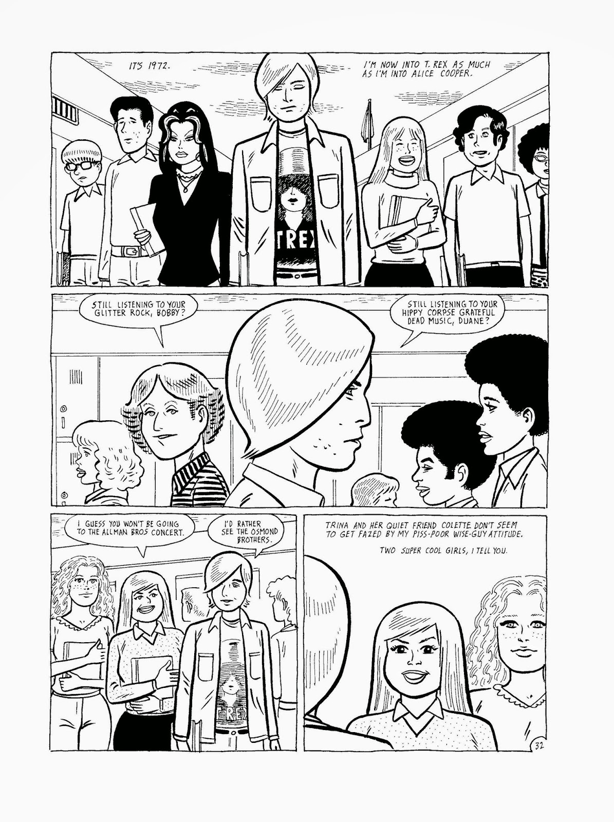
Bumperhead by Gilbert Hernandez review


Bumperhead is the second original graphic novel that creator Gilbert “Beto” Hernandez has done for Drawn and Quaterly, following last year’s Marble Season. Marble Season was a semi-autobiographical story that dealt with the joys of childhood. In my review I described it as “love letter to the magical delights and misfortunes of childhood”. Beto used his own experiences as a framework for the story and with Bumperhead he set out to do the same thing with his experiences as an adolescent. The result is a fascinating story about a young man who was forever shaped by his adolescent years and the life lessons that can be taken from his past experiences.

The book feels similar to a few recent works by Hernandez. Marble Season, of course, because it focuses on a period in a person’s life and develops that into a larger narrative. The other comic is the recent collection of Julio’s Day which tells of Julio’s entire life, from birth to death. Bumperhead combines these two narrative formats into a familiar yet different story of its own. The book starts with Bobby, a young man who is teased for having a big forehead, continues to spend a large portion of the book on his teenage and young adult years to finally wrap it up with a few pages of Bobby in his golden years to end with a strange and unconvincing declaration that he’s had a good life.

Along the way, Hernandez deals with several issues. The first is the passivity of youth and how that can shape a sad, isolated and depressing adulthood. Bobby doesn’t seem interesting in committing to anything one thing in particular. He loves music, he loves girls, he likes hanging out with his friend and taking part in recreational drinking and drug use but he doesn’t have any ambition. He does all of these things but a particularly attractive girl or an excellent record are enough to make him change interests. When discussing his future with a girlfriend, Bobby mentions he doesn’t have any interests in going to college. He’s simply happy to be done with high school and he’s ready for whatever will happen next. What he doesn’t understand is that by choosing not to pursue any in particular nothing worthwhile will ever cross his path.  


It’s not surprise that he ends up working a job he hates and living alone. That is, until he discovers the punk movement and decides to get angry. He uses this anger to create a new lifestyle for himself but it’s hollow. It has no meaning for him. People get angry for all sorts of reasons and we often try to maintain the anger for extended periods of time. So long that we often forget what initially caused us to be angry.  Bumperhead deals with this theme and we see Bobby deal with his anger in different ways throughout his life only to have it end with the recognition that it’s often not worth holding on to our anger as it’s a self-destructive emotion.

Bumperhead also proves to be an interesting remuneration as to how the smallest things from our past (regrets, thoughts, actions, feelings) can and often do haunt us for the rest of our lives. It’s a neat look at the idea that high school never ends. No matter what we do to change ourselves, we remain the same. We struggle with our identity and the identity of others to the point of stressing ourselves out. The consequences are that it begins to affect our health. We care so much about what other people think of us that we change and continue trying to change to no avail.


Bobby makes his way into the punk scene of the 1970s only to slowly move away from it all. He returns to the scene a few years later but he doesn’t recognize the movement anymore. He sees other punks, shirtless with shaven heads and piercings. He admits to himself that he doesn’t belong anymore. Did he ever truly belong within the punk scene or was it just a way for him to run away from his past experiences? Just like he moved from one girlfriend to the next during his high school days, in adult life he moves from one scene to the other. At one time he’s a lazy, booze sloshing couch potato, then he becomes a heavy drugs user only to move in and out of the punk scene for a few years. Along the way he breaks old friendships, makes new ones as he meets new people only to sever ties with them, makeup with old friends, and start all over.

At times Bumperhead feels like an anthology story. Beto uses the same characters is somewhat different roles in order to present the reader with alternatives to the lives of Bobby and the supporting cast. In each iteration the characters seem unhappy and it takes them their entire lives to recognize that they should stop pretending to be something they don’t truly want to be and simply be themselves with all their likes and dislikes. Even the characters who were consistent throughout the entire comic (and their life), such as Colette a born-again Christian who becomes a nun, doesn’t seem particularly happy with her life choices.

It’s quite nice that Beto doesn’t appear to be judging any of his characters. Instead, he presents their lives with such ferocious veracity as to make his themes that much more effective. Similarly to his black and white illustrations his storytelling presents a stark dichotomy, heartfelt portrayals of humanity contrasting with some of the worst decisions individuals can make in a lifetime.


This year Gilbert Hernandez won his very first Eisner Award for an untitled short story released in Love and Rockets: New Stories #6. He’s been nominated before but it’s shameful that the Eisner Award has failed to recognize such an important creator in comics. Gilbert Hernandez has worked with his brothers Jaime (and sometimes Mario) Hernandez on their ground-breaking and consistently spectacular comic Love and Rockets for more than thirty years. As if that accomplishment wasn’t enough, they’ve used Love and Rockets as well as their side projects to tell some of the most harrowing and heartfelt set of stories in any medium since the 1980s. They’re master storyteller, both of them, and it’s about damn time that Beto gets his Eisner. I wouldn’t consider New Stories #6  his best work but the man definitively needs to be recognized as being one of the great storytellers of our time. He’s worthy of your attention and readership and he’s got dozens of books in print, just waiting for you to dive in and shake you up a little. When people argue against comics being a trashy medium or being nothing but superhero stories, I suggest they read something by Los Bros Hernandez. The works of Gilbert Hernandez act as definitive proof that comics can tell some of the most powerful stories in print.

Saturday, 22 November 2014

Trillium by Jeff Lemire review


I’ve been a fan of Canadian writer-artist Jeff Lemire since I first read his Essex County trilogy. After that I started to read the rest of his works that were published at the time and I’ve followed his career as he started to write superhero comics for DC Comics. While Essex County was his breakout work, his first comic was Lost Dogs. He came to greater renown working on a now completed ongoing series for Vertigo Comics called Sweet Tooth. In the past few years he’s been alternating his superhero work with more personal and less mainstream projects with other publishers. His work for DC has been mostly writing and occasionally illustrating superhero comics. He’s worked on Superboy, Animal Man, Justice League Dark, and Green Arrow. His non-superhero comics include a retelling of H. G. Wells’ novel The Invisible Man. Generally speaking, I get a very different kind of enjoyment out of his standalone projects that are both written and illustrated by Lemire. Essex County, The Nobody, and Underwater Welder are all excellent reads. It’s only natural that I got excited for his latest standalone project when it was announced that Lemire would be doing a science fiction love story for Vertigo.

The story is set in two time periods, the primary one being in the year 3797. There, a scientist named Nika Temsmith has been trying to unlock the secrets of trillium, an alien flower. Her goal is to find a potential cure against a sentient disease that has killed all of humanity save for a few thousand. Most of Nika’s research is done near an alien city that is shaped like an Incan pyramid. In 1921 a veteran of the First World War, William Pike, is suffering from PTSD. He’s part of an expedition to find the lost temple of the Incas, somewhere in Peru. Both of their lives become intertwined when Nika travels through time and space to find herself face to face with William outside the temple. The temple and the trillium flowers help them to communicate despite their differences in language and culture. As consequence, the fate of their lives is intertwined with humanity’s survival in the future.

Trillium had tons of potential and I admit I had high hopes but having just read all eight issues in the collected trade paperback edition I can’t help but be disappointed. There are numerous problems with the story that I can’t help but feel Lemire may have rushed this comic while trying to juggle many of his other projects. His art has always had an unpolished, sketchy quality to it but it’s always been characterized by his ability to effectively capture tone and convey strong emotions. By opting to write a science fiction story Lemire has, perhaps unintentionally, revealed one of his greatest weaknesses as an illustrator. His design work is inconsistent and not always convincing. The science fiction elements such as the space ships, the space suits and the laser guns are torn between futuristic designs and retro designs. The laser guns look like cartoon laser guns and the space suit helmets look like goldfish bowls. It’s inconsistent to the point of distraction.

Additionally, the aliens are underwhelming. They’re far too humanoid in appearance and while I could excuse that if this was a television series with a restricted budget but Lemire’s pen doesn’t have those same restraints. It’s unfortunate but his style isn’t detailed enough to support the kind of visuals required by the story he wrote. There are certain pages that include dozens of characters, dense jungles or larger than life settings. You get an idea of what Lemire was trying to accomplish but it falls short of his vision.  


Visually the comic gives you the sense that the science fictional elements don’t really matter. They are set dressing and have little consequence on the overall story. The sentient virus, the space colonies, time travel and the use of the Incan ruins as a time travel device are all good ideas but they do no work together cohesively.

The aliens were particularly problematic as they didn’t play any role beyond protecting the flowers and then given them to Nika for an undefined use. Lemire worked closely with letterer Carlos M. Mangual to develop an alphabet for the aliens and most of their dialogue is written in that form. It’s a nice detail but it’s completely unnecessary. I haven’t used it to translate too much dialogue but the bubbles I did translated didn’t have anything substantial to add to the narrative.

Another thing that is poorly used is the trillium flower. Why is it important? The first issue suggest it might be useful for developing a cure against the virus but it’s used as a product to expand the mind and help overcome language barriers between different characters. That would be fine if it played a role in the story aside from allowing for the main characters to connect, but it doesn’t. You could say that having the main characters connect is important to the story but I felt the romance story was very forced. It was very unemotional and we’re not given any reason for their being a relationship between the two aside from the shared memories caused by the ingestion of the trillium flower. They are both misplaced from their time period and because of that I could understand that they’re linked, but love? Even romance? I don’t see it. I certainly didn’t feel it.

The book isn’t all bad though. Lemire is a skilled storyteller and even when he creates something as flawed as Trillium it still has its positive aspects. The most enjoyable thing about Trillium is that Lemire is stepping out of his comfort zone. A lot of his work is either set in a small tone and deals with themes of isolation and identity. He’s also done a lot of superhero work that has used those same themes but he has also explored other interesting ideas with those comics. He’s yet to do a story set firmly in the science fiction genre (you could argue that superheroes fall in that category). He’s challenging himself creatively and some of those shines through successfully here but not enough to make this a worthwhile read for readers unfamiliar with Lemire’s body of work.

While the story and the world building are disappointing, the skill with which Lemire illustrated his comic is as impressive as ever. The use of flip flopping page layouts works to the story’s advantage. The overall sense is one of disorientation which helps the reader identify with Nika and William who are experiencing an even greater disorientation due to the time travel and other strange and unexplained science fictional phenomena. Lemire forces the reader to flip the book around and read sideways. One issue splits every single page in two with one story being told on the top half. The second story on the bottom half requires you to flip the entire book completely over for the duration of the issue.


Lemire also works with regular contributor José Villarrubia who handles the colouring. Villarrubia is one of my favourite colourists in the business because he’s able to change his colouring style to best match the artist he’s working with. That’s true of his work with Lemire and it really shows in Trillium. Villarrubia’s colouring looks like watercolours and it helps to highlight the strangeness of Lemire’s story as well as the unusual quality of Lemire’s linework. These two creators make an excellent team and it’s a joy to have a story that allows for Villarrubia to show off some different tricks.

My excitement may have led to my less than positive reaction to Trillium but that doesn’t change the fact that it was one of the biggest missteps since the beginning of his career in comics. That’s not to say that it’s all bad. I recognize and appreciate the fact that Lemire tried something different. He could easily have spent his time writing yet another superhero comics or an equally formulaic story and ended up with a more enjoyable comic. I’d rather read an interesting failure than a bland, yet successful, cookie-cutter comic book. I’m convinced that Lemire has learn a lot about his abilities to tell this kind of story, something that is truly outside of his comfort zone if you compare it to his previous work. He pushed beyond his usual story limitations and even though the end result wasn’t impressive, his artistic devotion to create something new and different was still satisfying to me as a fan of his work. I can only trust that it was equally satisfying to him as an artist and that he will continue to expand his horizons and develop his storytelling skills. Trillium will certainly not be the last comic of his that I read and I’m already anxiously awaiting the next one.